OPPORTUNITY
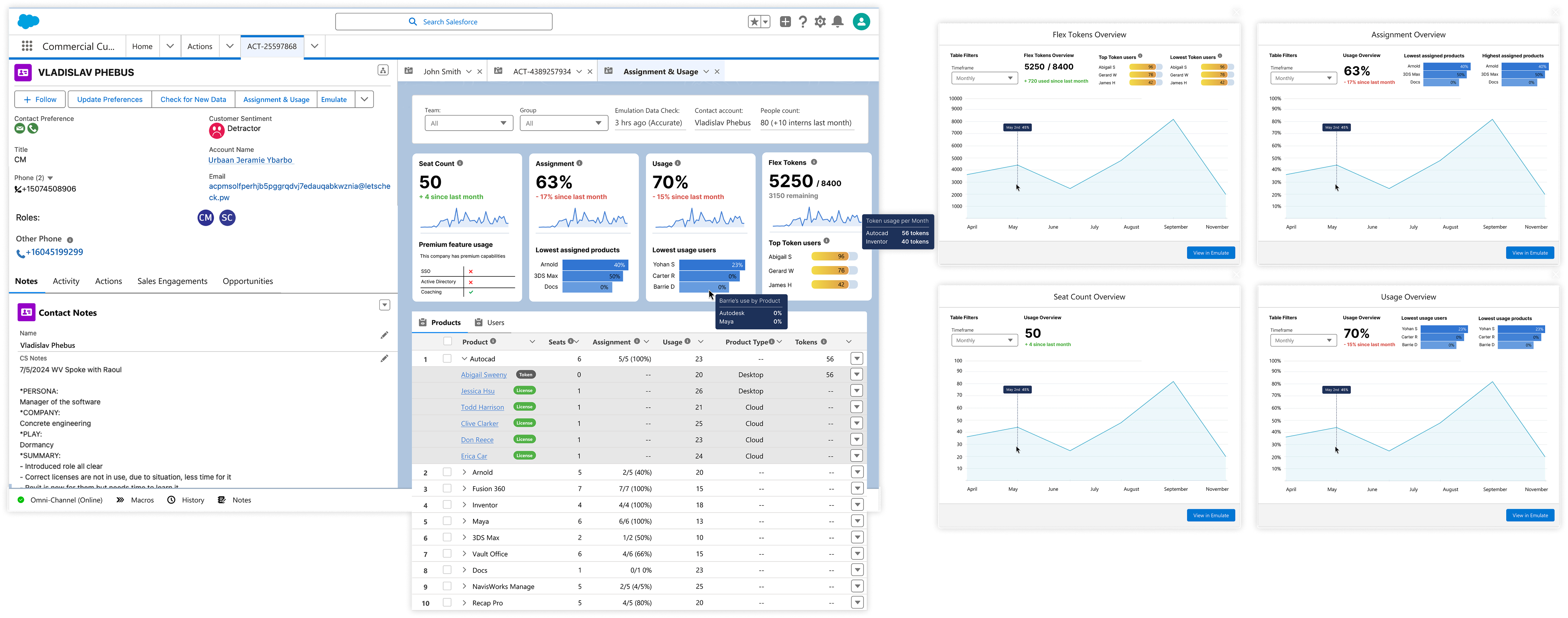
Advisors spend 37% of case time just gathering the context needed to address low assignment and usage, leaving less time to actually resolve the issue.
When Autodesk detects low product usage or assignment within a customer account, a Customer Success Advisor simply receives an action to investigate. The problem was that much of the information they needed lived outside Salesforce.
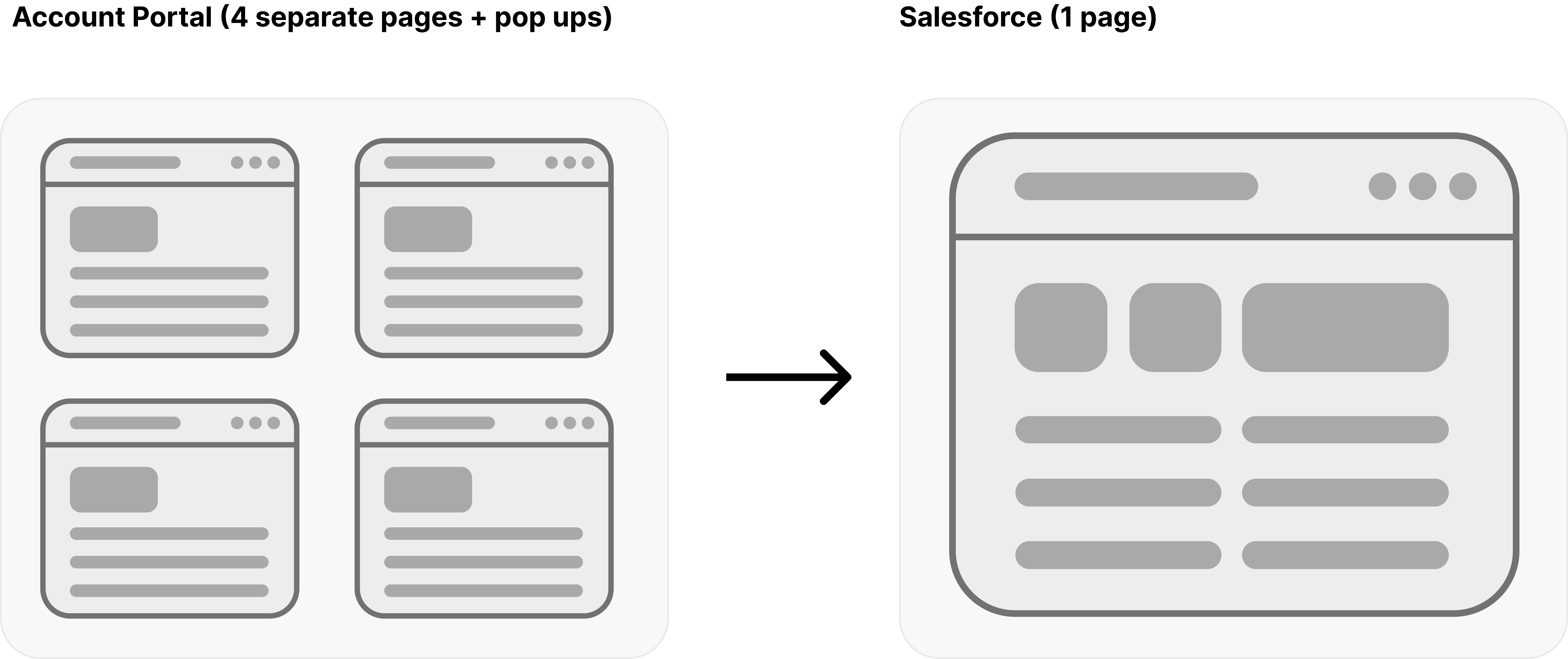
Advisors had to emulate the customer's account and navigate through several pages, links and pop-ups to understand what was happening before they could recommend a solution.
This accounted for 37% of the time they spent handling the case.
INTERVENTION
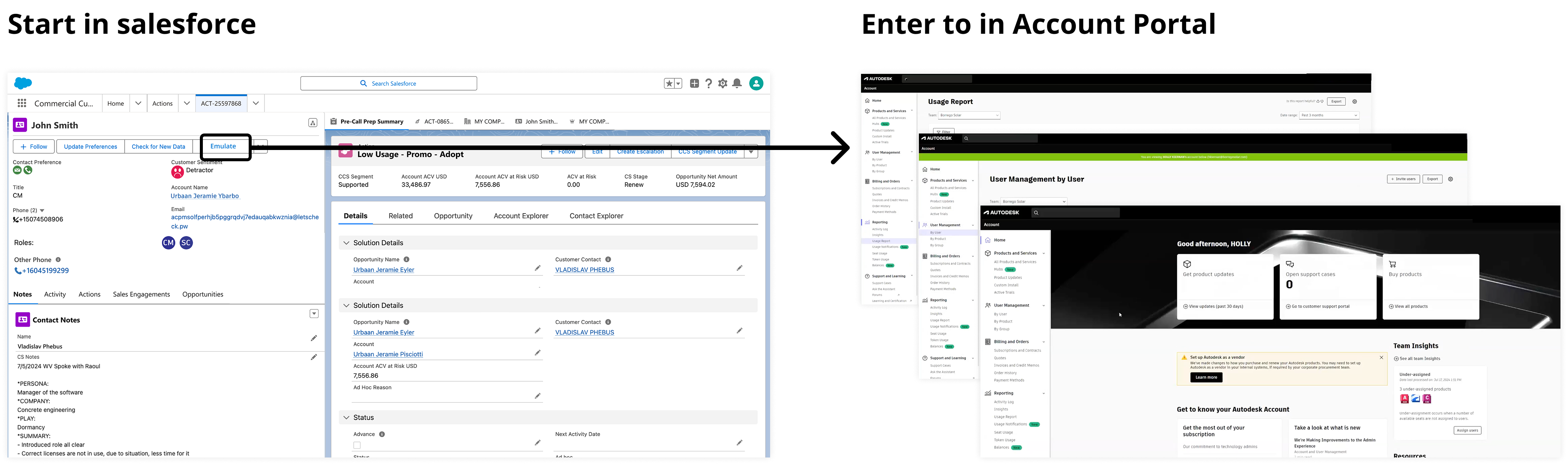
Bringing the information to the Advisor
I led the product design of a new experience that brought the most important customer usage data directly into Salesforce, in a section I called Assignment & Usage. Rather than recreate the Account Portal in Salesforce, the challenge was figuring out what information Advisors actually needed to understand the problem and take action.
UNDERSTANDING THE PROBLEM
Starting with the Advisor goals, not the dashboard
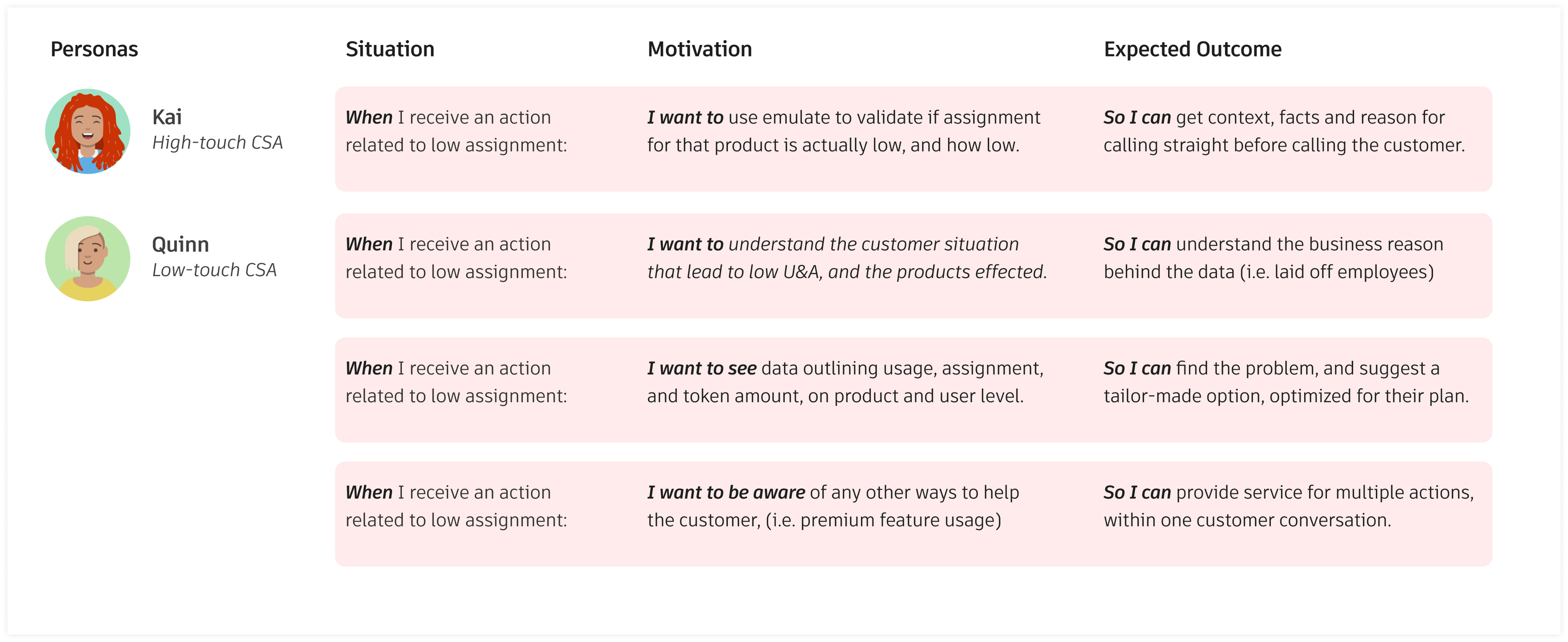
I started by researching how Advisors handled a low assignment or usage by a customer today. What emerged was a clear workflow: locate the problem (within the account portal), speak with the customer to understand the context, use the data to diagnose a solution, and identify any other opportunities worth discussing.
These became the key jobs the new experience needed to support.
DEFINING WHAT BELONGS IN THE PRODUCT
Every piece of data needs a reason to be there
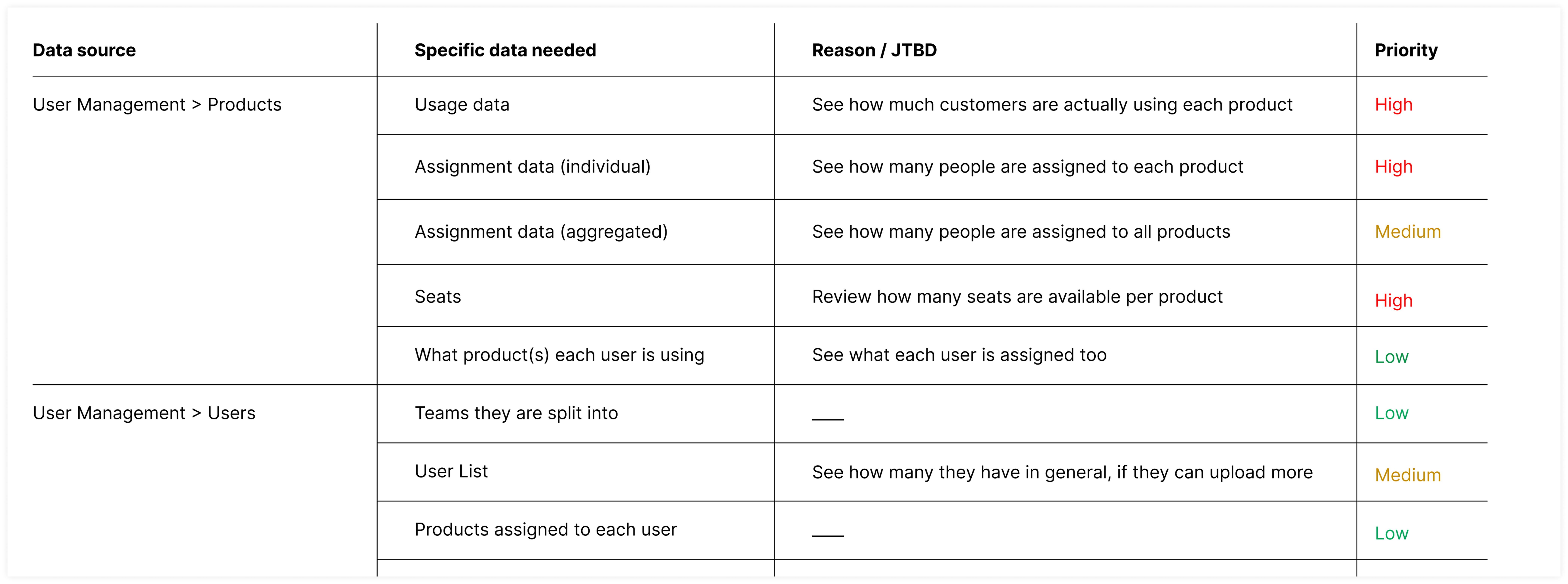
The account portal contained far more data than we could reasonably surface to help them locate and figure out the low usage/assignment issue. I mapped the available data back to each advisor jobs to be done, then had advisors rate its importance so that everything we included had a clear reason for being there.
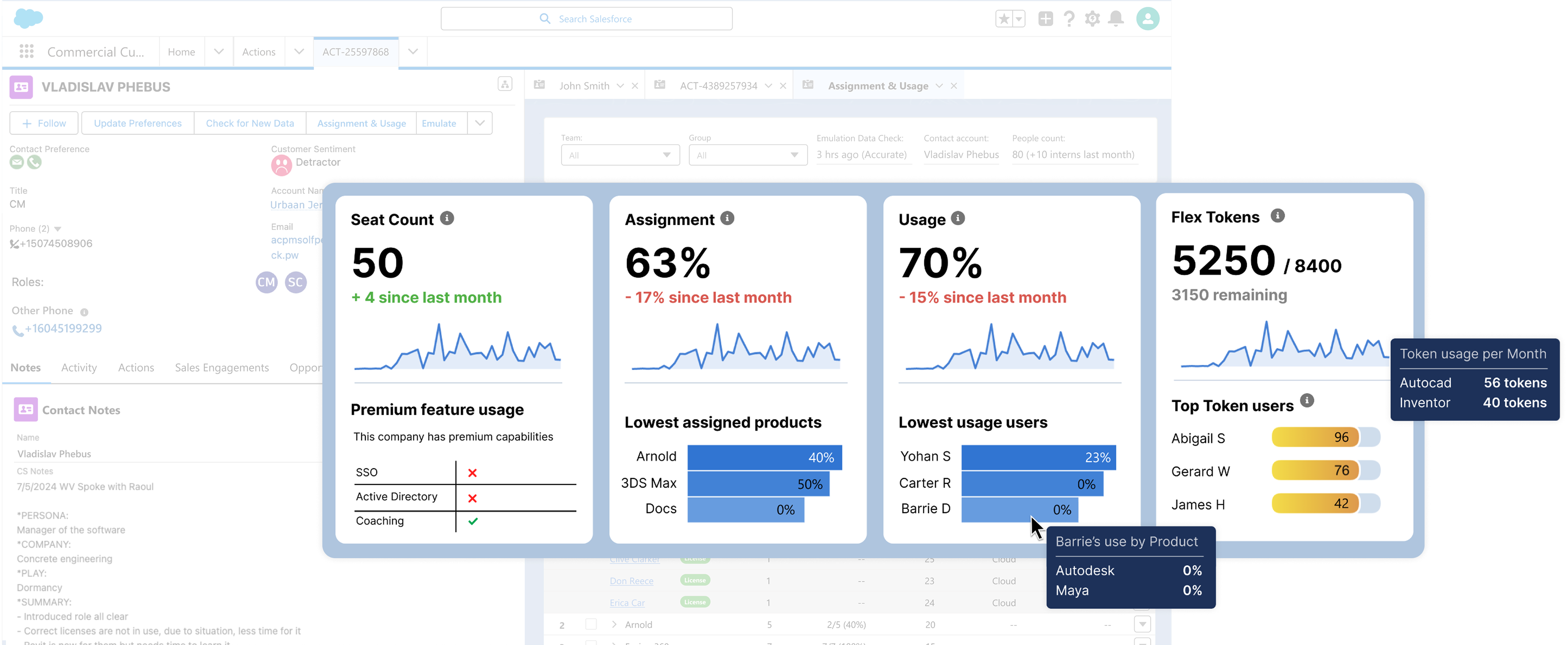
High-priority information including seat count, assignment, usage, and Flex Token consumption, was given prominence on the dashboard, while secondary information remained accessible with less visual emphasis.
DESIGNING THE EXPERIENCE
Insights first. Details when you need them.
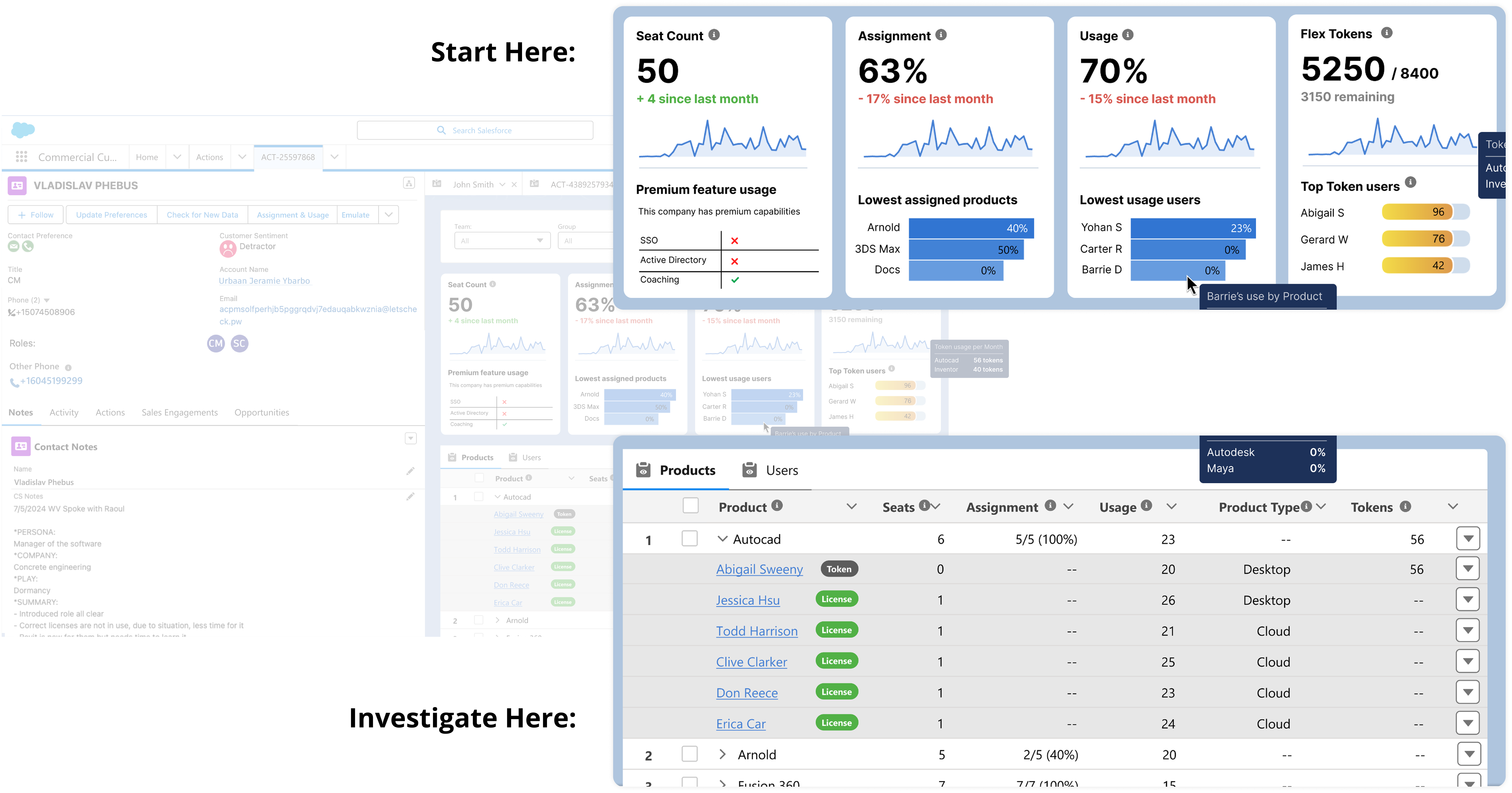
The goal was speed. Advisors needed to quickly identify where something looked wrong, then dig into the underlying data when they needed more detail.
This led to two core layers:
Account Insights
This surfaced common problems related to assignment and usage, such as zero-usage users, high Flex Token consumption or licences that might be better allocated elsewhere.
Product & User Tables
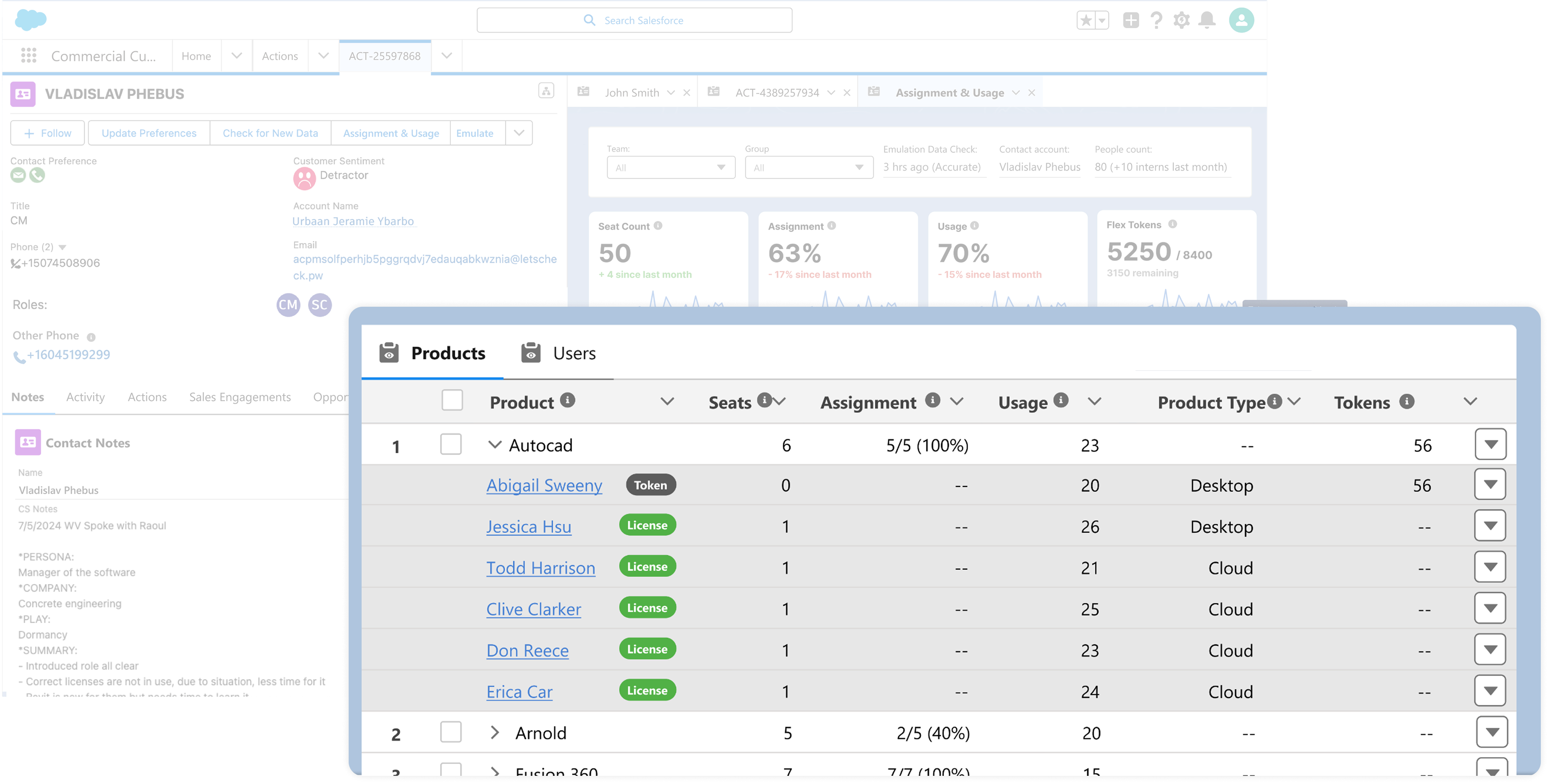
This provided the underlying data needed to investigate those problems and determine where to intervene.
In other words, the overall experience is:
Spot the problem → Investigate the details → Speak with the customer → Recommend a solution
VALIDATING THE DIRECTION
Could this actually replace Account Emulation?
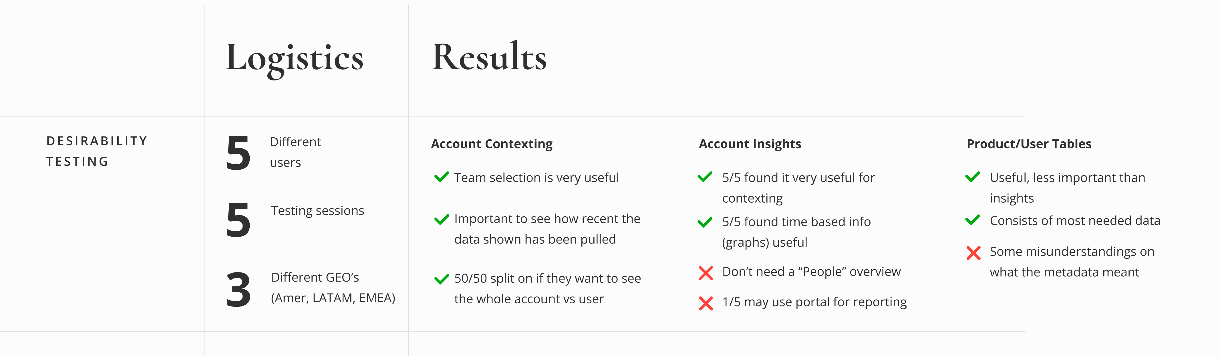
The main question I wanted testing was whether it gave them enough information to handle the task without returning to Account Emulation. I tested the concept with Advisors across three regions, focusing on the three main sections account context, insights, and the product/ user tables.
Insights
The direction was largely validated, but testing also clarified what mattered most:
Account context was useful, but data freshness needed to be clearer. Insights were particularly valuable for quickly understanding the problem.
A broad "People" overview wasn't necessary in the header.
There was no clear preference between account- and user-level views.
Some of the more complex metadata needed better explanation.
These findings helped refine both the hierarchy of information and how much context we needed to provide around the data.
THE FINAL EXPERIENCE
From four pages to one focused workflow
After testing, I revised the prototype and developed the high-fidelity experience using Salesforce Lightning Design System and CRM Analytics.
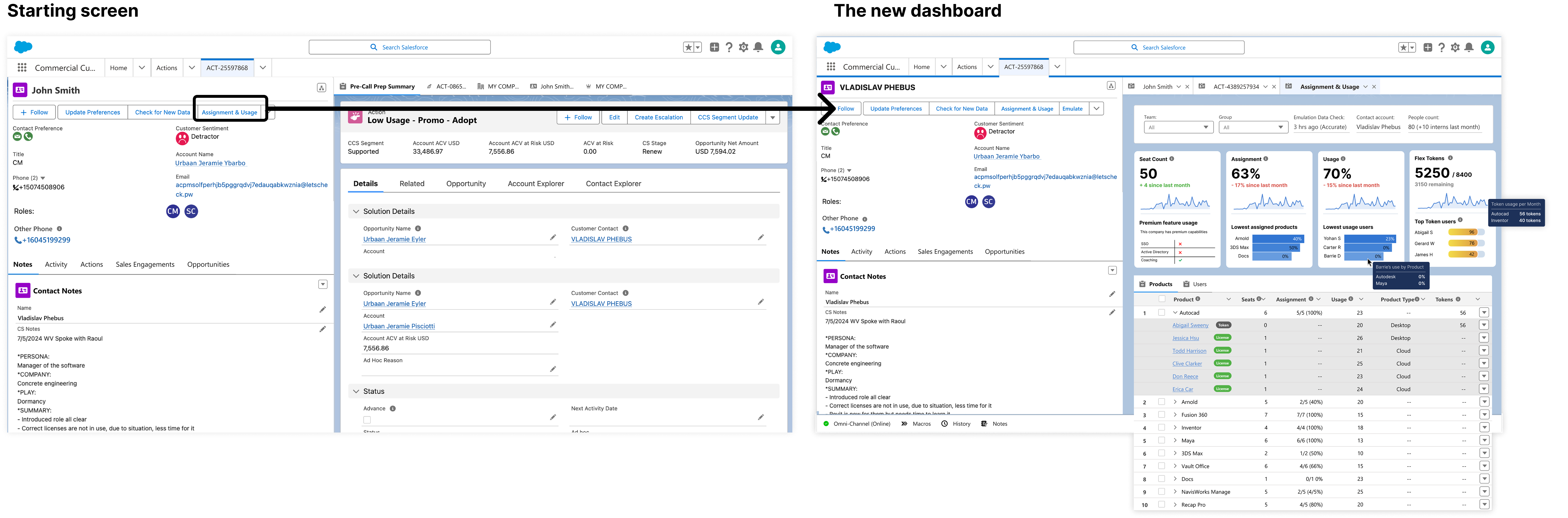
Beneath is the starting point to the new experience. When a new action comes in, the Advisor simply opens it up (Starting screen), then loads of the Assignment and Usage dashboard from the tab (New Dashboard).
HOW IT WORKS
Context → Insight → Investigation
Step 1: Know what you're looking at
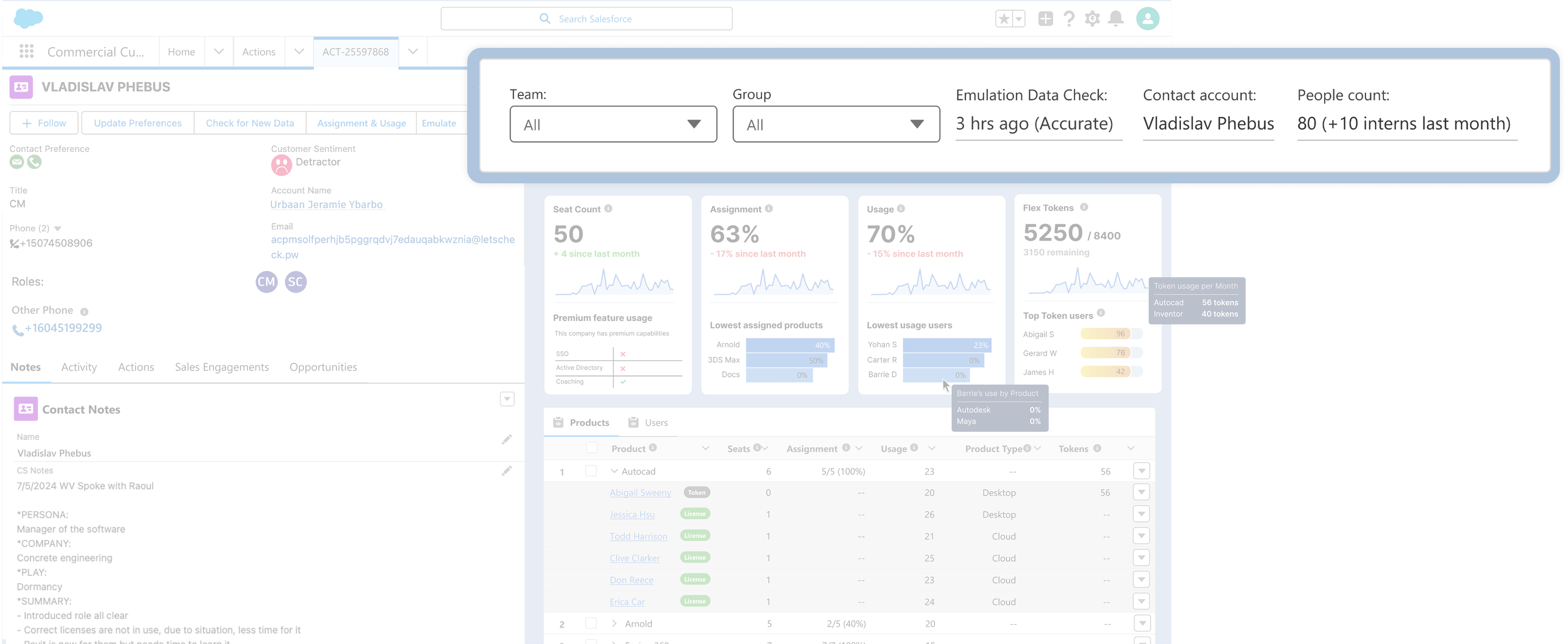
Account context establishes whose data the Advisor is viewing, allows them to select the relevant team, and shows when the data was last updated. This was a need that became particularly important during testing.
Step 2: Find where to look
Account Insights surface the most important patterns based on the scenarios uncovered during research, helping Advisors quickly identify where they should investigate, based on the incoming action.
Step 3: Understand what's happening
Product & User Tables provide the deeper investigative layer, allowing Advisors to compare assignment, usage and Flex Token behaviour across products and users so they can see who’s using to many, and needs their own license, and who doesn’t use their license enough and can just be using flex tokens.
Step 4: Understand the data in context
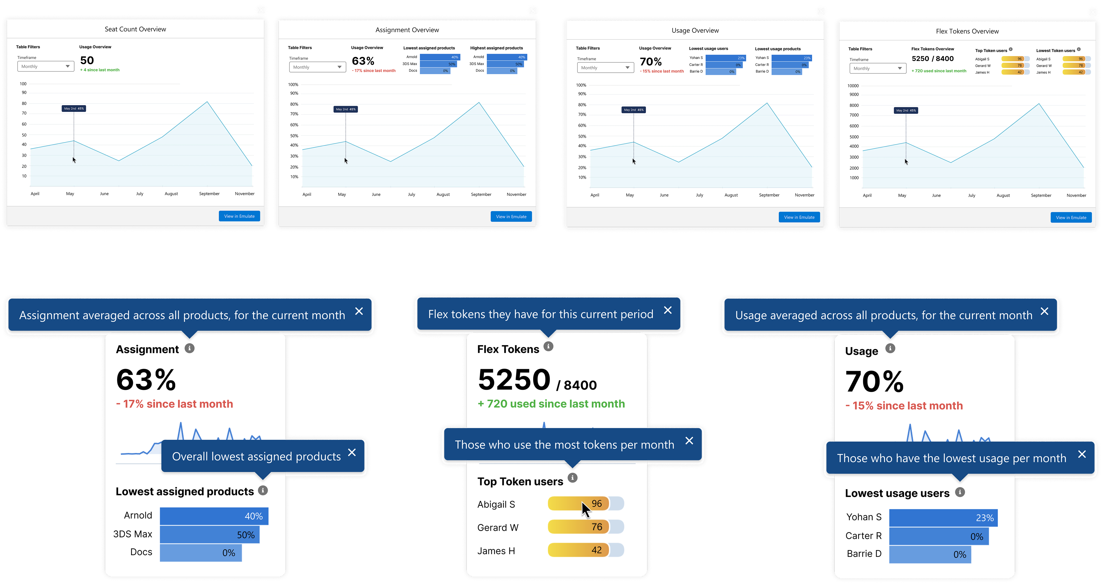
Testing also led to more time-based usage information and contextual tooltips, helping Advisors understand how data was aggregated and what it meant without leaving the workflow, another request found during testing.
WORKING THROUGH CONSTRAINTS
What happens when the ideal solution can't ship as designed?
The product continued to evolve as it moved toward development with developers bringing up several concerns.
Problem 1: Uncertainty Around CRM Analytics
At one point, access to CRM Analytics (how we would visualize the insights) became uncertain. To account for this, I created an alternative Salesforce-only version so the core workflow wasn't dependent on the visualization technology. The decision was later reversed, allowing us to move forward with CRM Analytics.
Problem 2: Viewport Width Limitations
Development also pointed out the experience had to be roughly half the available width so the existing action information (on the left) could remain visible (a constraint in our Salesforce environment), which was different from the original full screen proposal.
The original design contained seven insight cards. Rather than compress everything into the smaller space, I used the prioritization table to figure out which insights were essential to the advisors core workflow and which could be deferred.
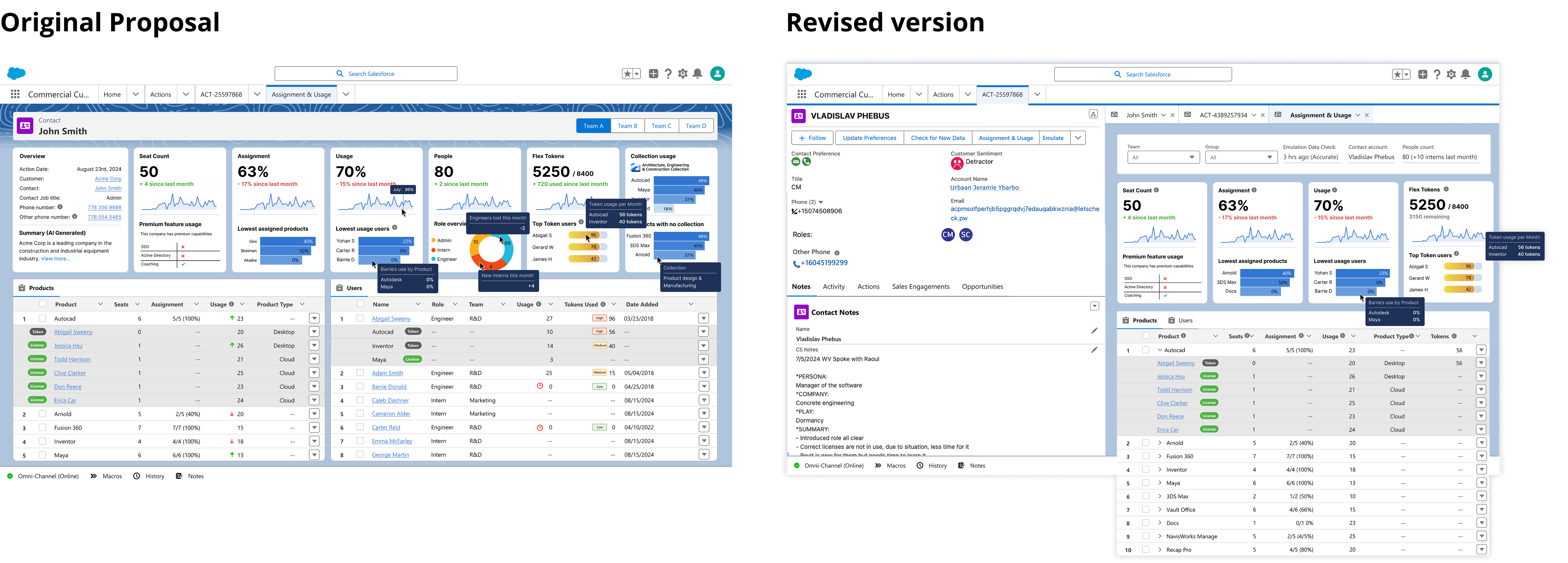
Planning a phased release
Due to scope, management later asked how the experience could be released iteratively. The question became: what was the smallest version we could release that still helped the Advisor successfully handle the task?
I helped determine which sections could come later (via the earlier prioritization table) while preserving enough value for the initial release.
The product thinking outlived the platform
The concept was well received and prepared for development, but Autodesk’s potential move away from Salesforce created uncertainty around implementation.
My contract ended before the transition, so I don’t know what ultimately shipped. I was later told the project’s research, workflows, requirements, and strategy were being used to evaluate replacement vendors and ensure the new platform could support the needs we uncovered.
The interface was designed for Salesforce. The product thinking wasn’t.
REFLECTION
I was subcontracted to Autodesk for nearly two years, where I learned to navigate complex systems, align stakeholders, and balance user, business, and technical needs.
I also became deeply familiar with Salesforce, giving me the confidence to explore ideas while understanding what was realistically possible.
Autodesk’s scale and engineering capabilities meant I could see work reach people within weeks, which made designing practical tools that improved people’s working lives especially fulfilling.
Definitely one of my favourite projects I’ve worked on.